Android 12 is expected to be the next major Android update. Recent leaks of a new build of Android 12 have given us a glimpse of what to expect with the latest update. Here’s a look at the latest Android 12 UI leak that showcases changes to widgets and notifications. Find out what we know so far!
Android 12 UI Leak: Widgets and Notifications Overview
Brand-new details of the Android 12 significant redesign have leaked a few days ahead of the expected Google I/O via a tipster. According to the YouTube video released by the tipster, a somewhat brief marketing reel of the Android 12 operating system was showcased, detailing the numerous changes it brings to the table.
Changes to Widgets and Notifications in Latest Android 12 UI:
If one must judge from the reel, the Android 12 operating system will make use of the left-aligned clock as an alert center and notifications base. The time will still be displayed at that spot, but the number of pending notifications will also be visible right within a circle alongside the clock. When you pull down on the clock, the notifications shade opens.
The new changes to this crucial display area are perhaps the most apparent or obvious when your lock screen is on. In that state, the large clock takes up most of the display on the lock screen. The top-left of the Android 12 screen will no longer showcase a more miniature clock but several notification icons.
Google seems to have woken up from its slumber and noticing the changes in other devices in the Android universe. The US-based firm appears to be introducing a newly redesigned keyboard, app icons – and other UI elements – that showcase more rounded keys. All these are designed to match seamlessly in order to create a highly consistent design across the system.
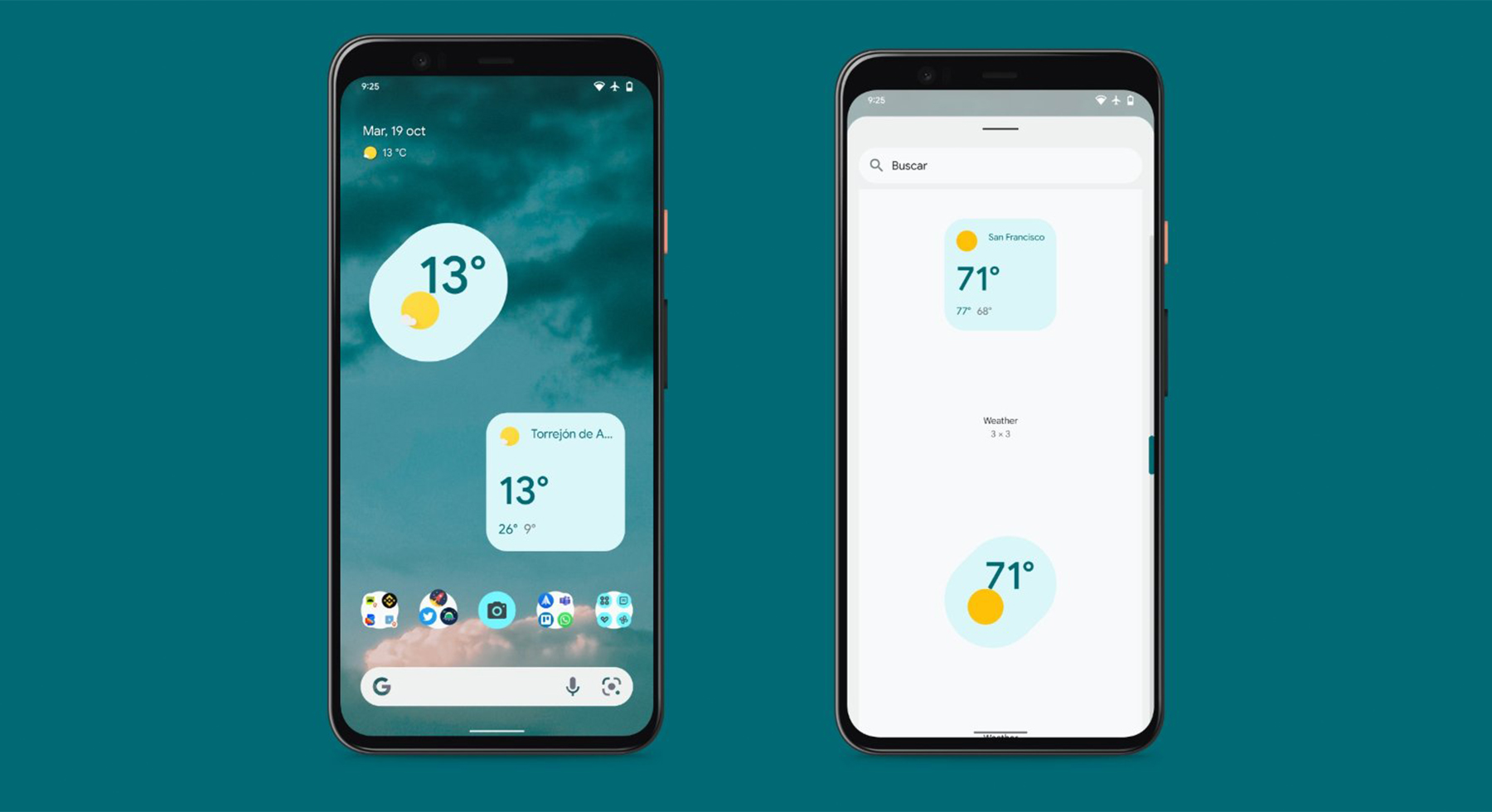
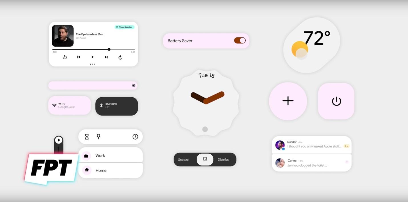
Other details observed in the Android 12 reel – as well as the leaked images – include the highlighting of the changes to the widgets. This includes brand-new clock and alarm sliders, a music playbook widget, a new volume slider, group notifications, as well as a weather widget. Users will notice newly redesigned Bluetooth and Wi-Fi toggles.
Also Read: Google Assistant Color Changes Suggest Android 12 Theming Support
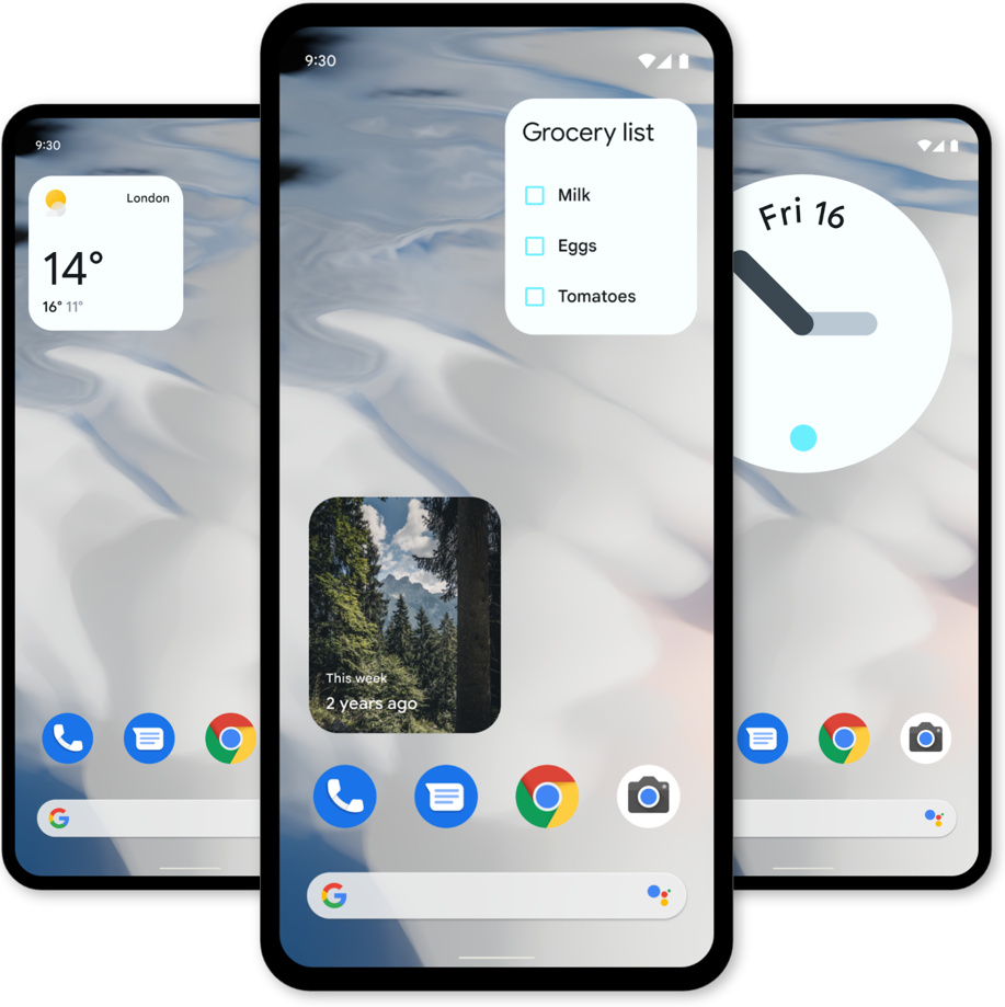
These small changes are a lot and are highly noticeable. However, they add up to create a welcoming and cohesive Android UI.
The leaked Android 12 UI images share remarkable similarities to the designs that were spotted in earlier Android 12 builds. Google appears to be much more committed to contrasts, pastel colors, as well as fluid user interface elements in its next operating system design.
It is still pretty early to accurately guess precisely how the Android 12 UI will look like in the future. But with Google I/O coming up this week, every Android user will undoubtedly get more looks and knowledge about the Android 12’s operating system and which designed elements will be retained or discarded.
Google is undoubtedly gunning for some big or significant changes in the Android universe.
Also Read: 12 Android Terminologies You Should Know
Google has more surprises in store for us in the near future, and we are excited to see them. Are you excited about the new UI on Android 12? Leave a comment below!


